
As we outlined in our definitive 2026 Home Colour Trends edit, this year’s palette isn’t about fleeting pastels or quiet neutrals alone — it’s about depth, intent, and quiet sophistication.
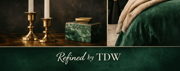
Leading that evolution is emerald green — a colour that marries classic richness with modern poise. In spaces where calm and confidence matter, emerald doesn’t shout; it grounds. It brings depth without heaviness and character without chaos.
In this deep dive, we explore why emerald has become the defining colour of 2026 interiors: how it works, what it pairs beautifully with, and how this refined hue can elevate a room from simple to timeless.
Why Emerald Green Feels So Right Right Now
For years, interiors leaned heavily into pale neutrals and safe minimalism. While beautiful, many homes began to feel unfinished — light, but lacking soul.
Emerald answers that.
Psychologically, green is associated with balance, restoration, and reassurance. Emerald, in particular, adds gravitas. It references nature, heritage interiors, and classic design — while still feeling modern when styled thoughtfully.
In uncertain times, people gravitate toward colours that feel:
- Grounding
- Protective
- Enduring
Emerald green does exactly that. It makes a home feel held.
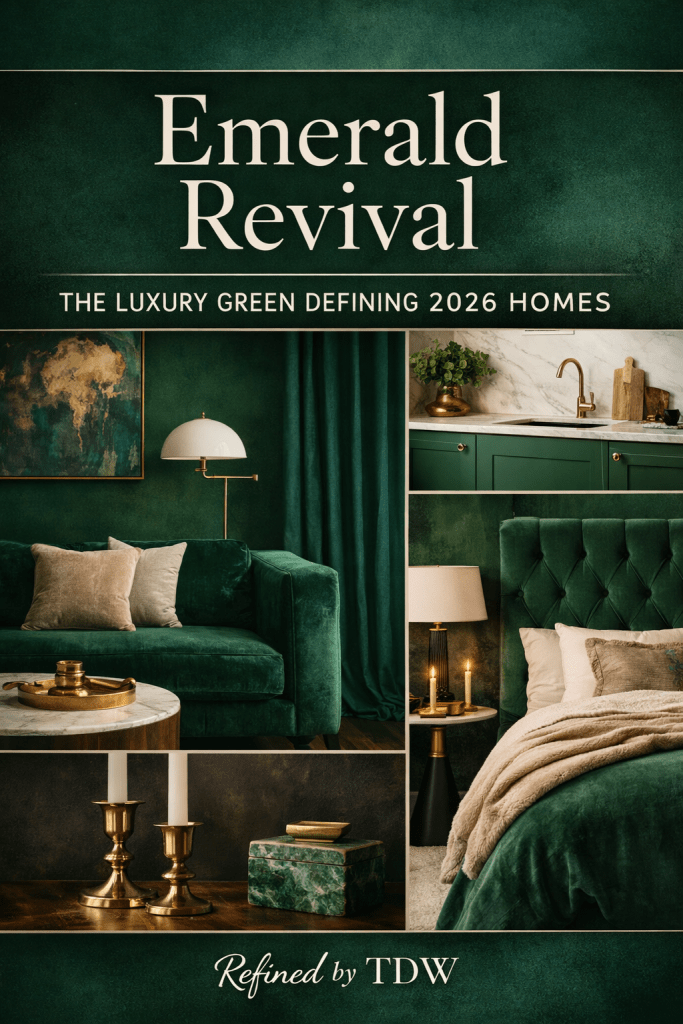
Where Emerald Works Best in the Home
One of emerald’s greatest strengths is its versatility. Used correctly, it enhances rather than overwhelms.
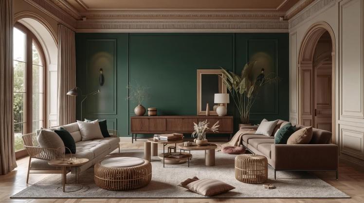
Feature Walls
Emerald is at its most striking when used as a single, intentional statement:
- Living room feature walls
- Dining spaces
- Bedrooms behind the headboard
It creates depth without closing a room in — especially when paired with the right finishes.
Cabinetry & Built-Ins
Kitchen islands, wardrobes, or shelving in emerald feel bespoke and considered. The colour adds instant character while remaining timeless — especially when combined with brushed metals or natural stone.
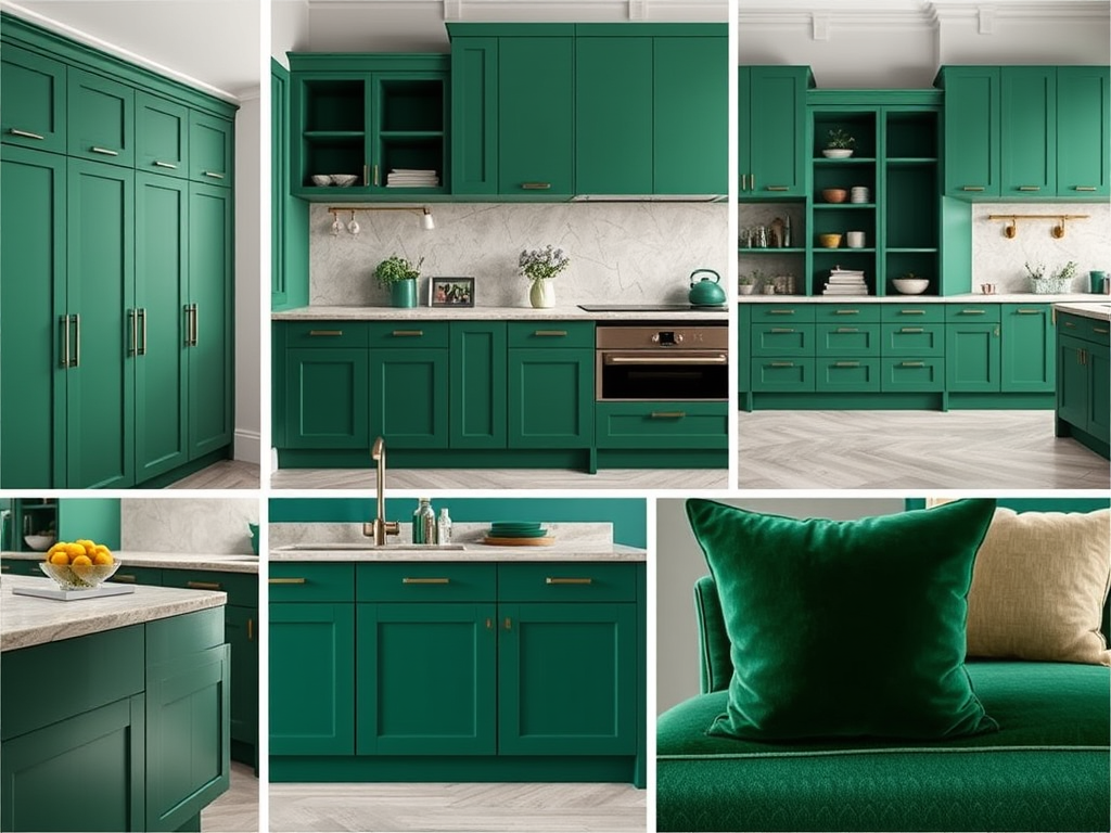
Soft Furnishings
For those easing into colour, emerald velvet cushions, throws, or upholstery introduce richness without commitment. It’s an excellent way to test the tone before going bolder.
What Emerald Pairs Beautifully With (And Why)
This is where many people stumble — not with the colour itself, but with what surrounds it. Emerald thrives when balanced correctly.
Warm Neutrals: The Essential Counterbalance
Pair emerald with:
- Warm whites
- Soft oat
- Cream
- Stone
These soften the depth of green and prevent it from feeling heavy. Avoid stark, blue-based whites — they fight the warmth emerald brings.
Natural Woods: Grounding and Organic
Oak, walnut, and darker woods echo emerald’s natural roots. Together, they create a space that feels layered, lived-in, and quietly luxurious.
Metallic Accents: Subtle, Not Shiny
Brushed brass, antique gold, or soft champagne tones elevate emerald beautifully. Think:
- Lamps
- Handles
- Side tables
Avoid overly polished chrome — it disrupts emerald’s richness.
Jewel-Tone Accents (Used Sparingly)
Emerald pairs exceptionally well with:
- Oxblood
- Deep navy
- Soft plum
Used in small doses, these tones add sophistication without tipping into excess.
The Skirting Board Question (And the Right Answer)
One of the most common design hesitations is skirting boards — and it’s a valid one.
The refined choice?
Keep skirting boards, architraves, and ceilings warm white or soft ivory.
This frames the emerald rather than competing with it, and keeps the room feeling intentional rather than overwhelming.
For more confident spaces, painting skirting boards the same emerald tone can work — but this is best reserved for rooms with ample light and minimal visual clutter.
Why Designers (And Homeowners) Are Loving Emerald
Emerald green has longevity. That’s the key.
Unlike trend-led shades that peak quickly, emerald:
- Ages well
- Photographs beautifully
- Feels richer over time
It adapts as styles shift — pairing just as well with minimal interiors as it does with layered, traditional spaces.
Perhaps most importantly, it allows homes to feel personal again. In a world of copy-paste interiors, emerald signals thoughtfulness. It suggests that choices were made carefully, not quickly.
How Emerald Makes a Space Feel
A home finished in emerald doesn’t feel styled — it feels settled.
It creates:
- A sense of calm without coldness
- Luxury without excess
- Confidence without noise
This is why people are drawn to it instinctively. Emerald doesn’t try to convince — it reassures.
The Refined Perspective
Emerald green isn’t about following a trend.
It’s about choosing depth over distraction. Substance over surface.
As part of the 2026 Home Colour Edit, emerald sets the tone — anchoring interiors in something lasting, thoughtful, and quietly beautiful.
Because refined homes don’t chase attention.
They hold it.
Get involved:
If this palette spoke to you, there’s more to come.
Subscribe to Refined by TDW for curated interiors, emerging colour trends, and considered edits designed to help you build a home that feels calm, elevated, and distinctly yours — one thoughtful choice at a time.
Comment below:
Where would you use emerald in your home — living room, bedroom, or somewhere unexpected?
Or:
Which colour from the 2026 palette should we explore next?
Discover more from REFINED by TDW
Subscribe to get the latest posts sent to your email.

